Designing a better project management tool for the future of communication and clean energy
Sitetracker is an industry-leading project management tool for the telecom and energy industries. I joined Sitetracker in 2021 with a few goals: owning a product, building a culture of design, and better understanding how to make products customers love.
A few highlights from my time in this role include:
- Leading weekly design critiques to push forward the conversation of craft on our team. Designers were able to learn from each other and grow their presentation skills in a safe environment.
- Creating a mobile app design system for iOS and Android that other design team members will use for future mobile design efforts.
- Meeting with junior team members to help them level up with best practices for research, or direct design feedback
- Supporting a complete company rebrand that included pitching logo ideas, creating a visual style for product imagery for our website, and redesigning the mobile app to match our new brand.
Project deep dive: Offline mode for the Sitetracker Mobile App
Our customers need to work offline
Sitetracker customers in developing countries build network connections in remote areas with no network access until construction is complete.
The Files screen provides key info for on-site work like instructions, schematics, and installation guides. We had “offline mode” which lets users save limited content, but they had to view it before going to the work site.
Understanding the problem
- Talking to customers to determine their specific needs and acceptable data limits. Storing too much data could hurt app performance.
- Learning what devices customers used, especially in other countries, to ensure our solution worked on all phones.
- Analyzing competitors' solutions to understand their data storage approaches and avoid complex designs.
- Asking our sales team about prospects' other solution choices and customers' struggles to identify issues we should address.
- Take an inventory of all of the content that will be stored, and how much effort it would take to make it offline accessible
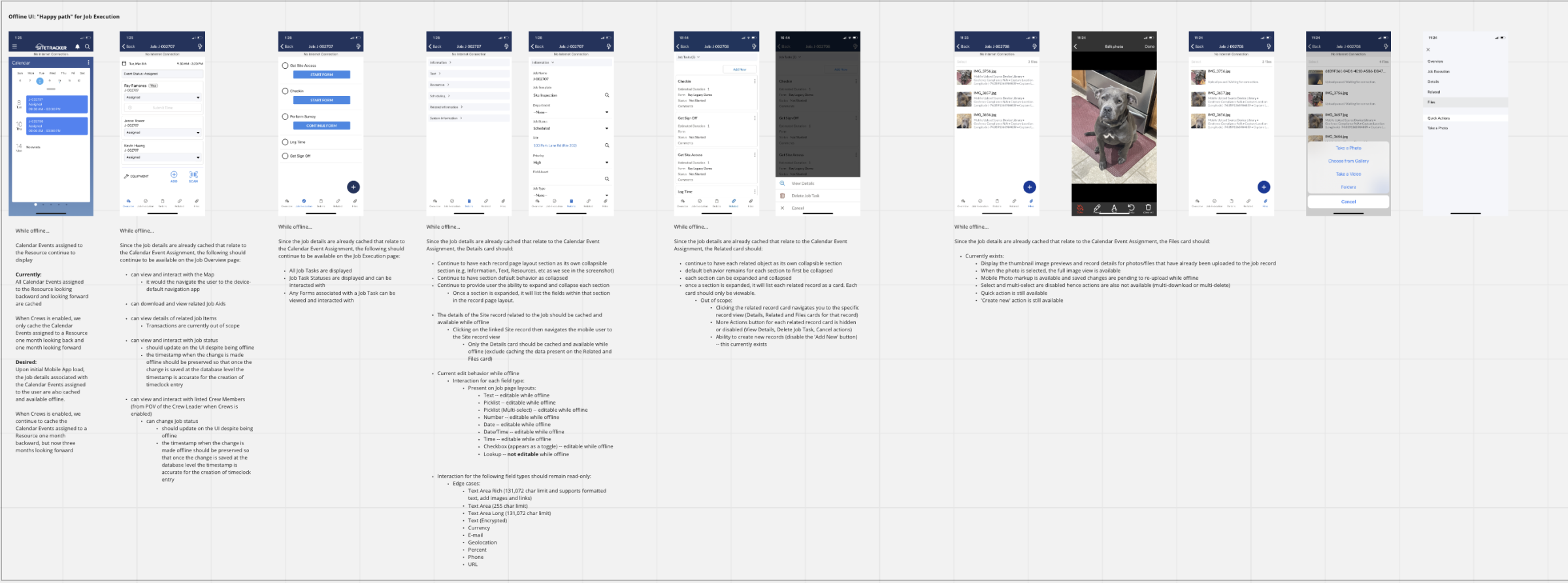
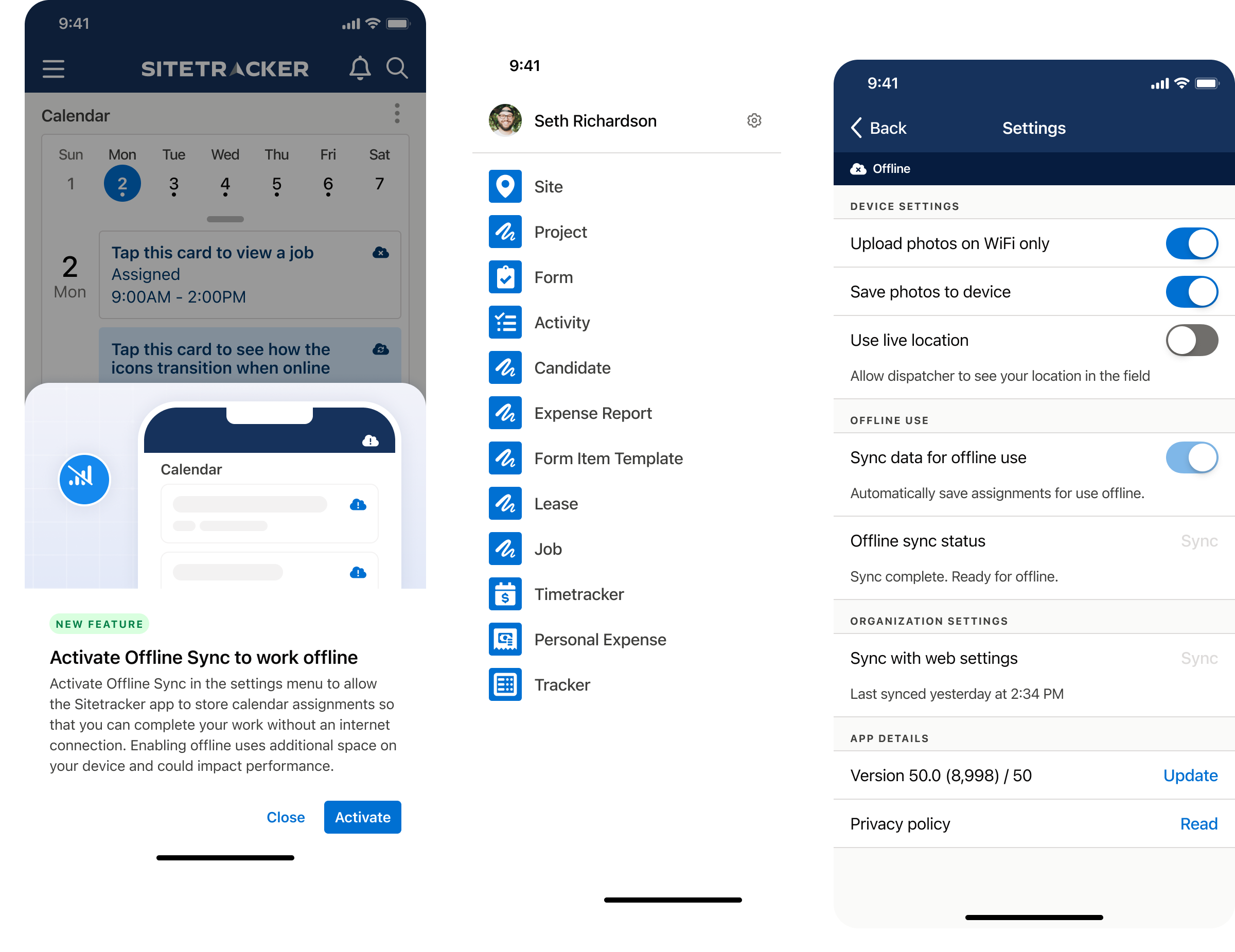
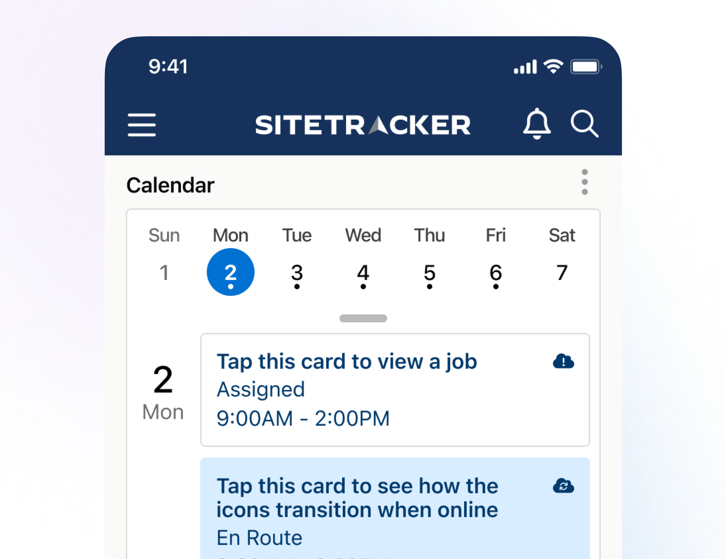
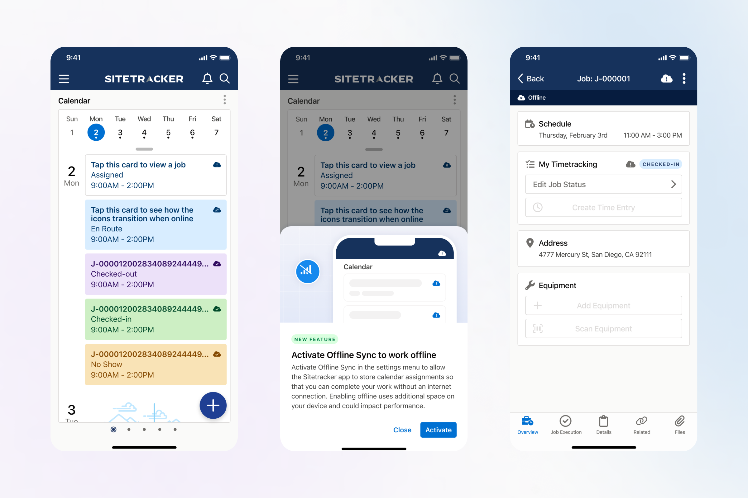
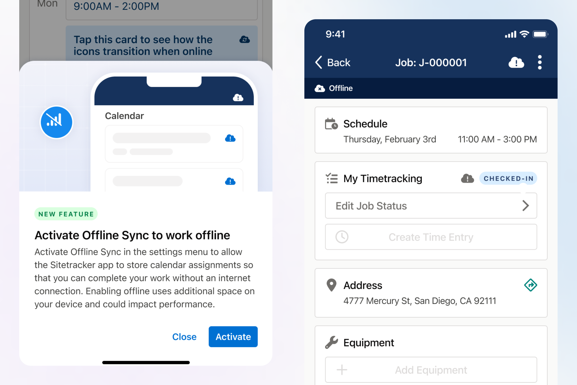
We used this learning to think up possible solutions and start getting feedback. The visuals that I created allowed us to check with the customer to ensure the functions made sense, and our engineering leads could help us understand possible challenges with implementation.
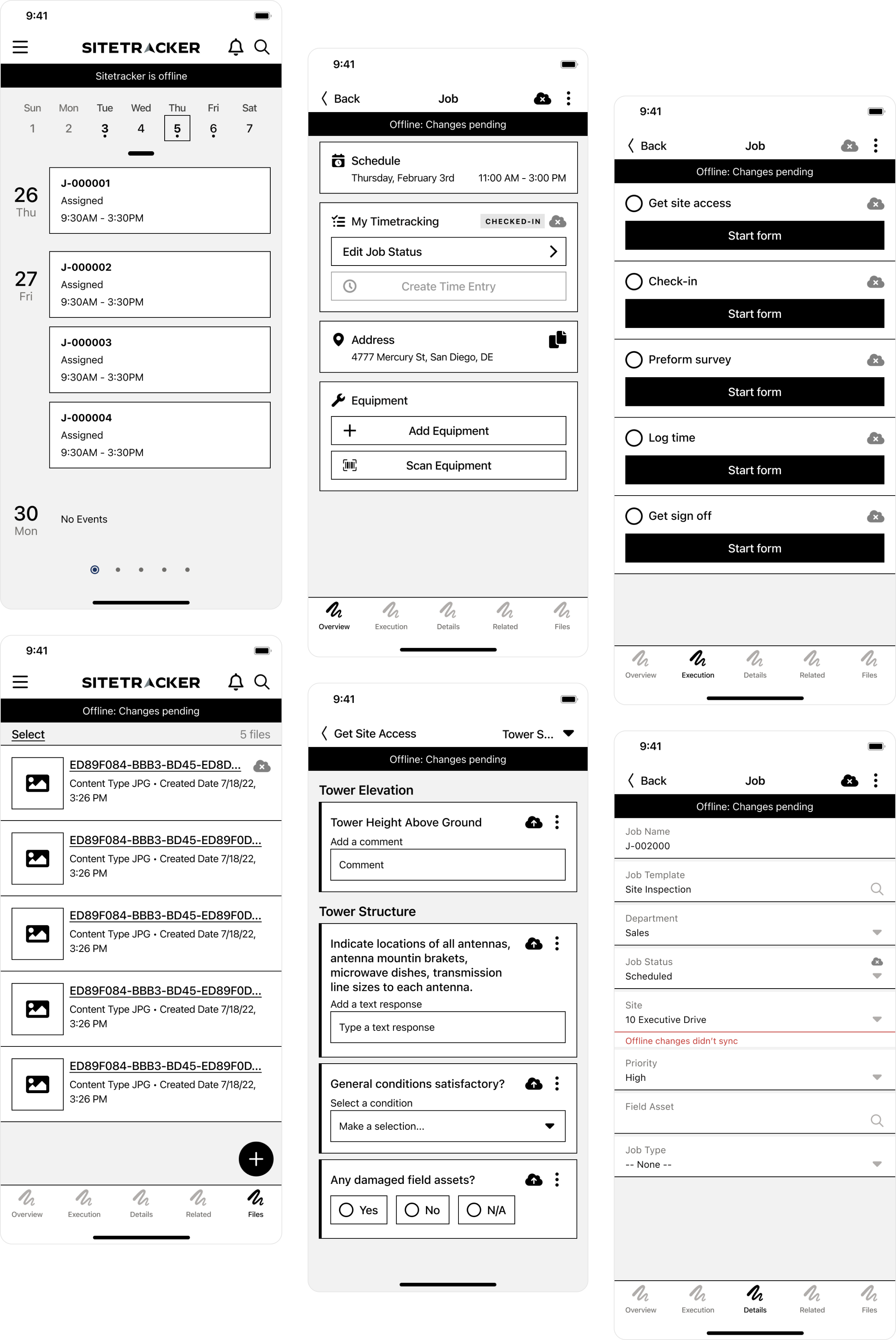
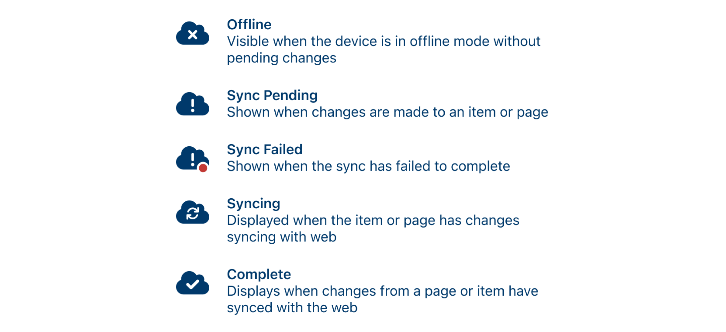
Ultimately we settled on a design that would show a cloud for an item that was changed offline and not synced.
Defining the solution
We aimed to give users control over our service's functionality on their devices. By activating offline mode, customers can choose what to use without wasting space.
A few constraints that I faced with the design
- We don’t own the top bar in our app (it's a library, and our version is very outdated), that’s a library with limited changes that can be applied
- We already have elements in the top bar, and removing them would impact other functionality
- I didn’t want to place a specific control for offline mode at this level. It could appear to some users that this would allow them to toggle this on or off per screen. We needed something universal. On is on, off is off.
These constraints lead me away from designing an experience that relied on toggles within the top bar (a pattern some competitors use).
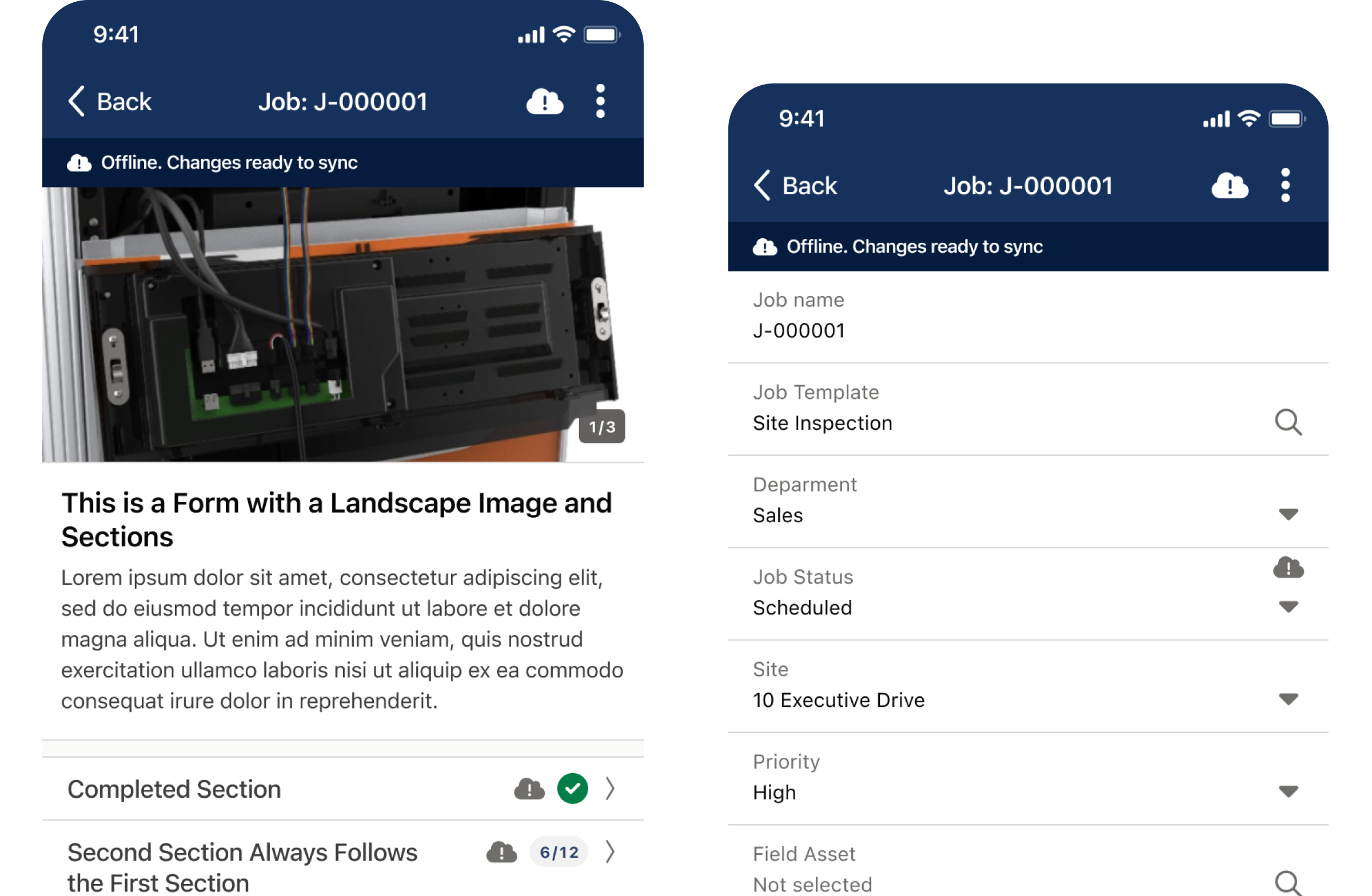
An important discovery I made when trying to address complexity is how we will show what items have possibly been changed and need to upload to the web when the connection is working. I explored a few ideas, but I settled on using the top bar to display that items are waiting to sync, and then showing the specific items that need to sync in the UI.
I created a simple chart that showed each of the states of this indicator so we could communicate this with internal teams and customers to understand how the functionality would work.
The final solution
Ultimately we landed on a single toggle that a customer could activate in the settings screen. We also had a few issues with the menu bar, so I redesigned it to accommodate the new symbol in the old section at the top of the menu.
We also gained a new toggle in settings, allowing me the opportunity to think about how we can better call out the groups of functions listed in the menu. We moved from a flat menu to a more structured design that helps users quickly interact and find the settings they need.
To provide visibility into the new functionality, I designed a new callout card to help users see and activate the new functionality. I presented our solution to customer steak holders that were at risk of churn if this functionality wasn’t released because of the impact on their business. They were thrilled!
Here are some more visuals of how this design was implemented.