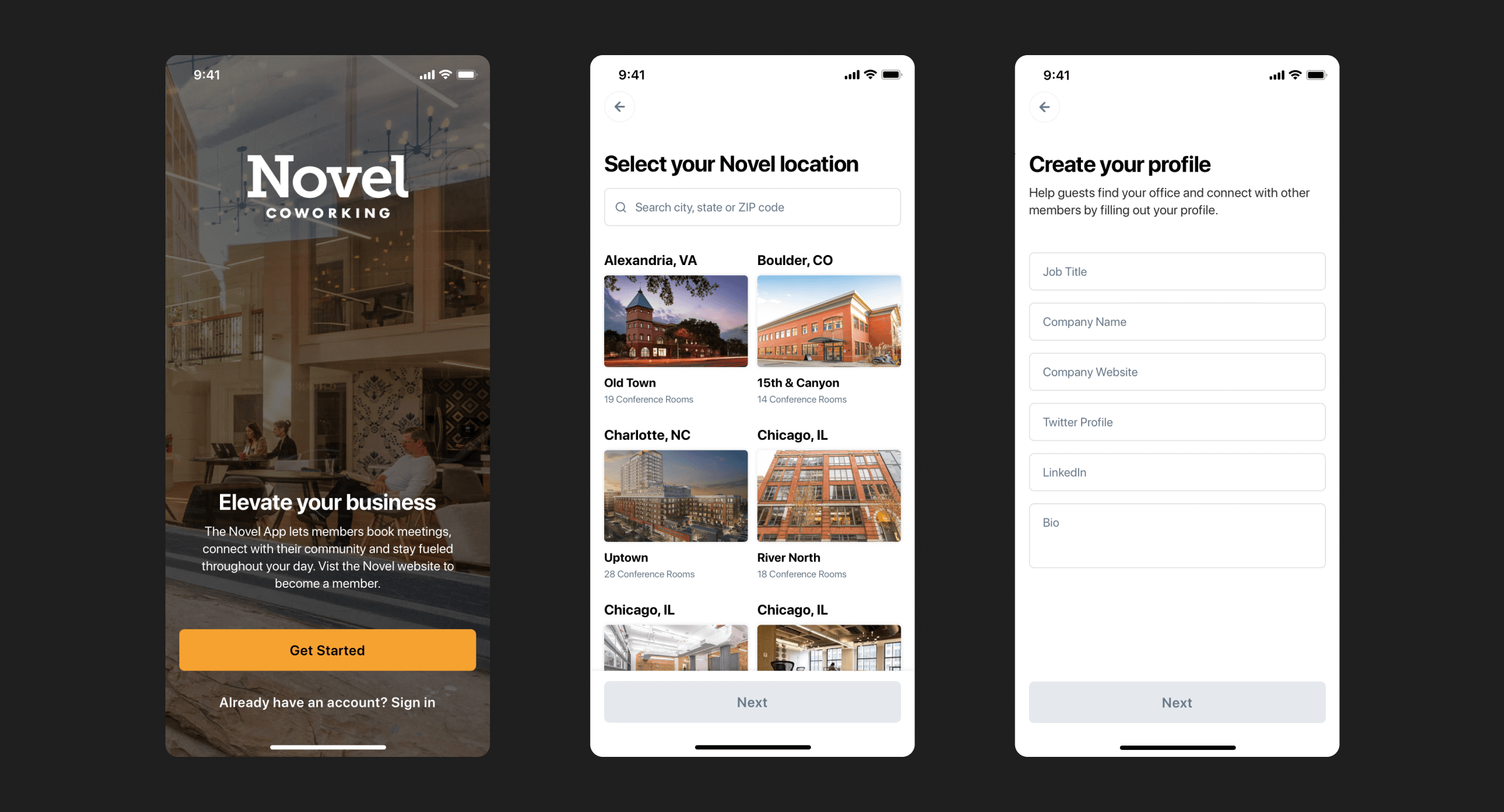
A new experience for Coworkers
A new mobile experience designed to be a simple way to reserve a coworking space and connect with your local coworking community

Function
We didn't want the app to feel like a second calendar, but rather, we wanted the app to act as an extension of the user's calendar by helping them find space to meet after they have scheduled a meeting.
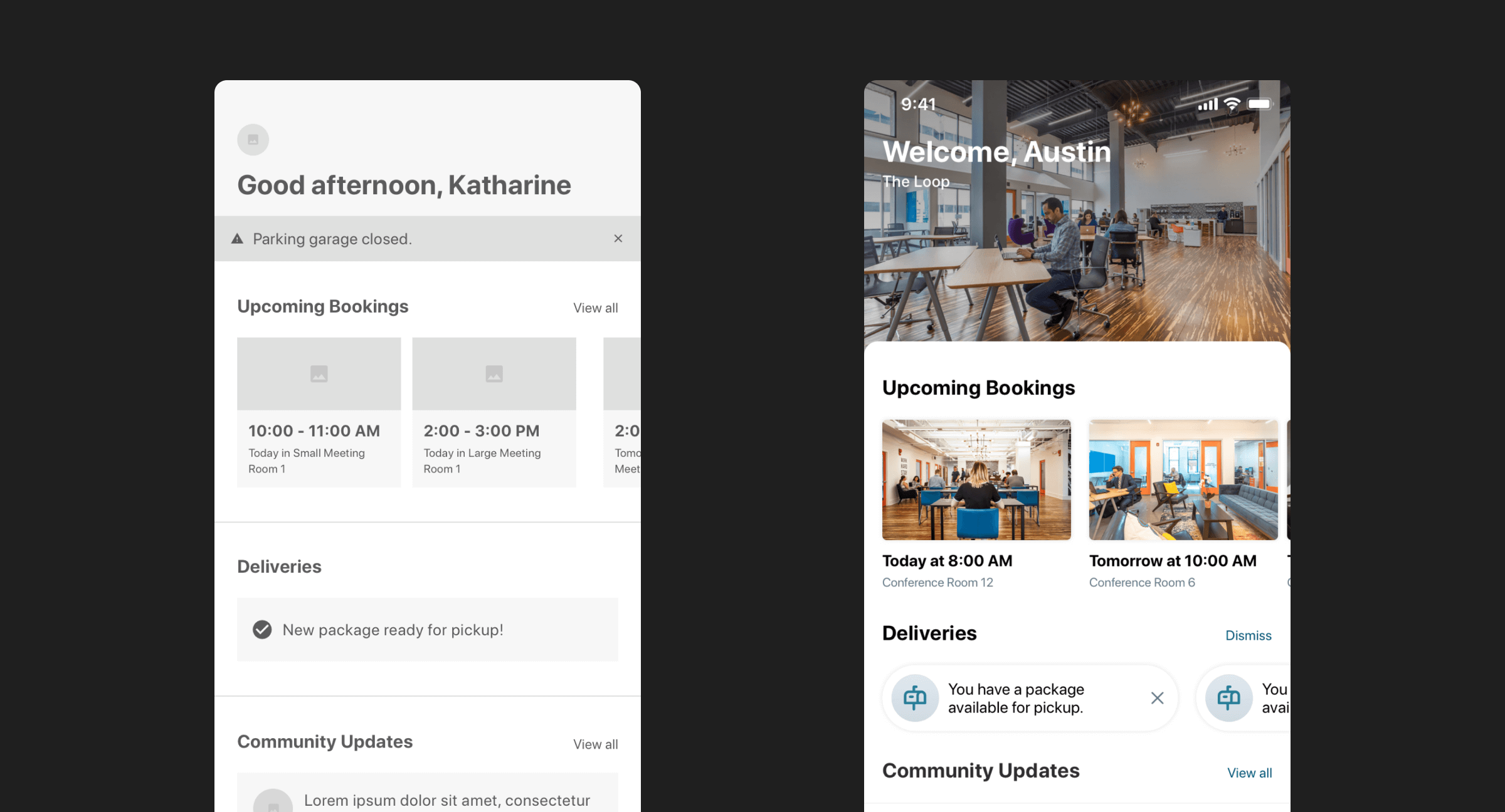
We also knew that the very nature of the coworking space is flexibility. Users can come and go, and sometimes not come back to the office for a few days. We used this understanding when thinking about how to create a home view that quickly shows the user in one view everything they might have coming up, or even missed. I like to think of this more as a briefing rather than a feed or stream of content. The goal is that things stay in similar places, but update when needed so you always have visibility into the most recent, most important items.
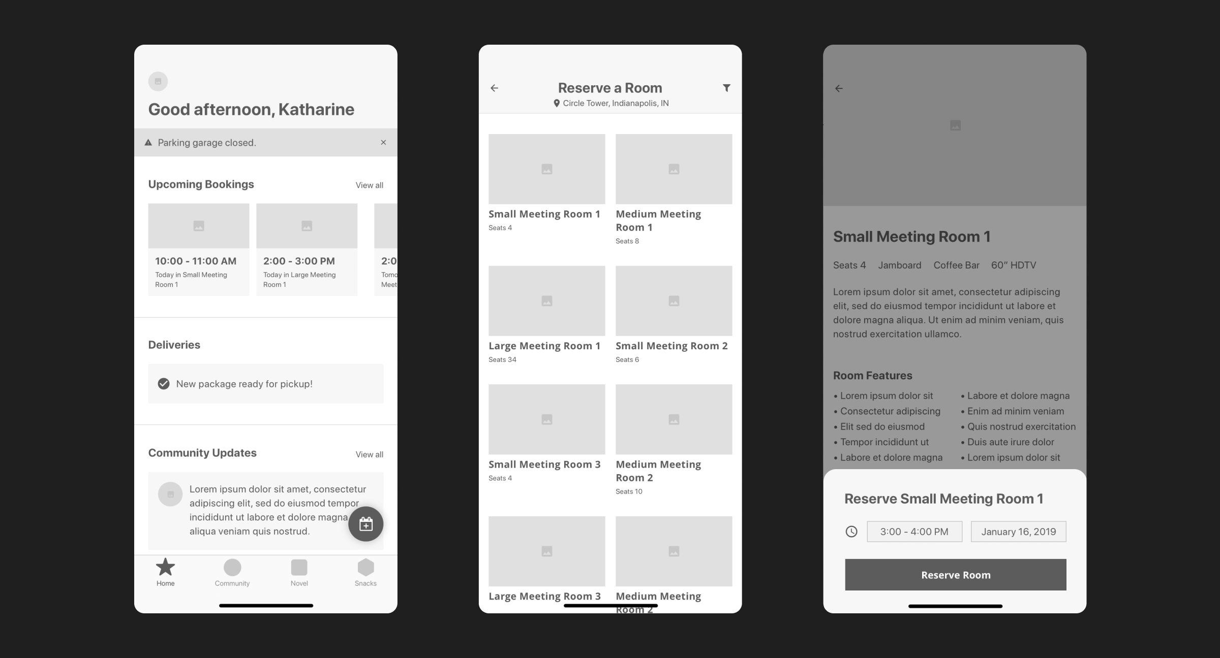
Here's how we thought about the content presented on the home view:
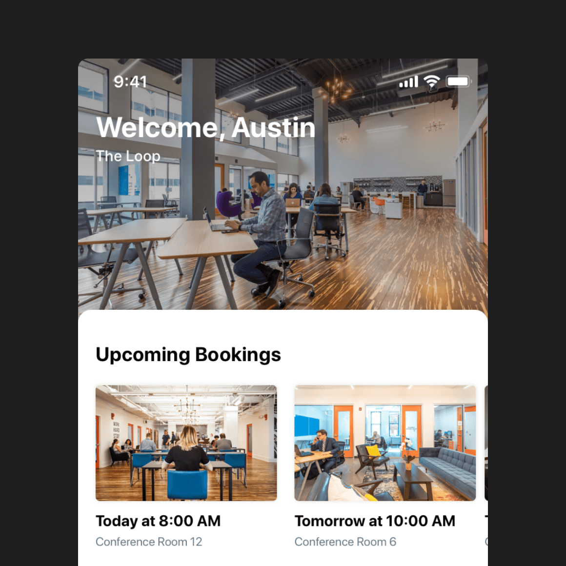
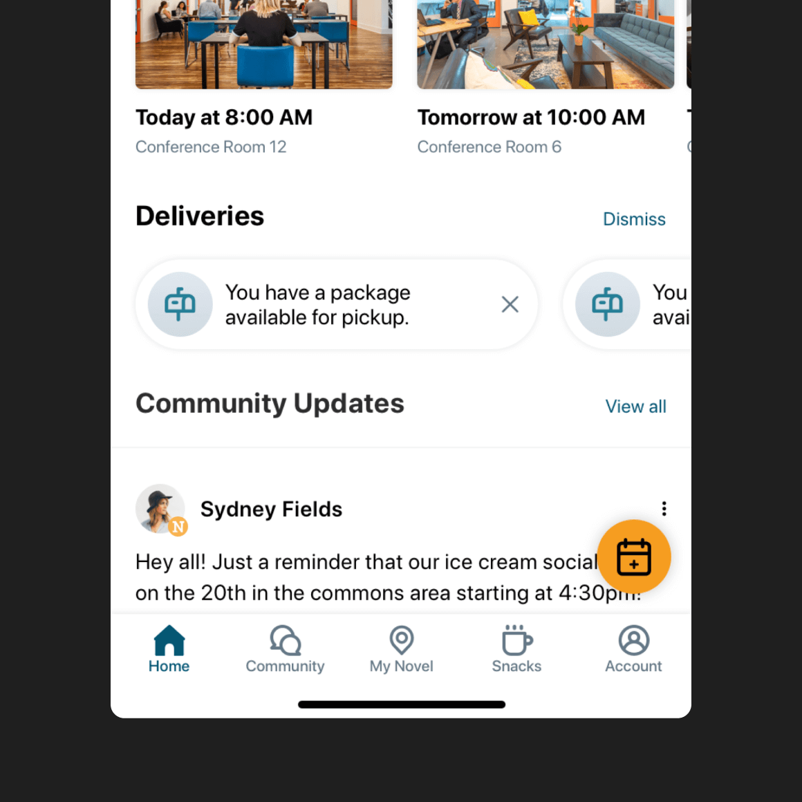
- Hero image: This space welcomes you to the app, and acts as a quick reminder of the location you are working from. Users in some cities have access to more than one location, as well as users that are traveling between locations. We want to make sure they are aware of what space.
- Upcoming bookings: This section was intentionally designed with a horizontal scroll in mind. The purpose was to maximize the amount of content one could see that relates to their day, not a week. When empty, we fill this space with an empty state that prompts users to reserve a meeting room.
- Deliveries: This space is pretty straightforward. If a coworker has a package or mail available for pickup, they can see it here. This space is not visible if they don't have a notification.
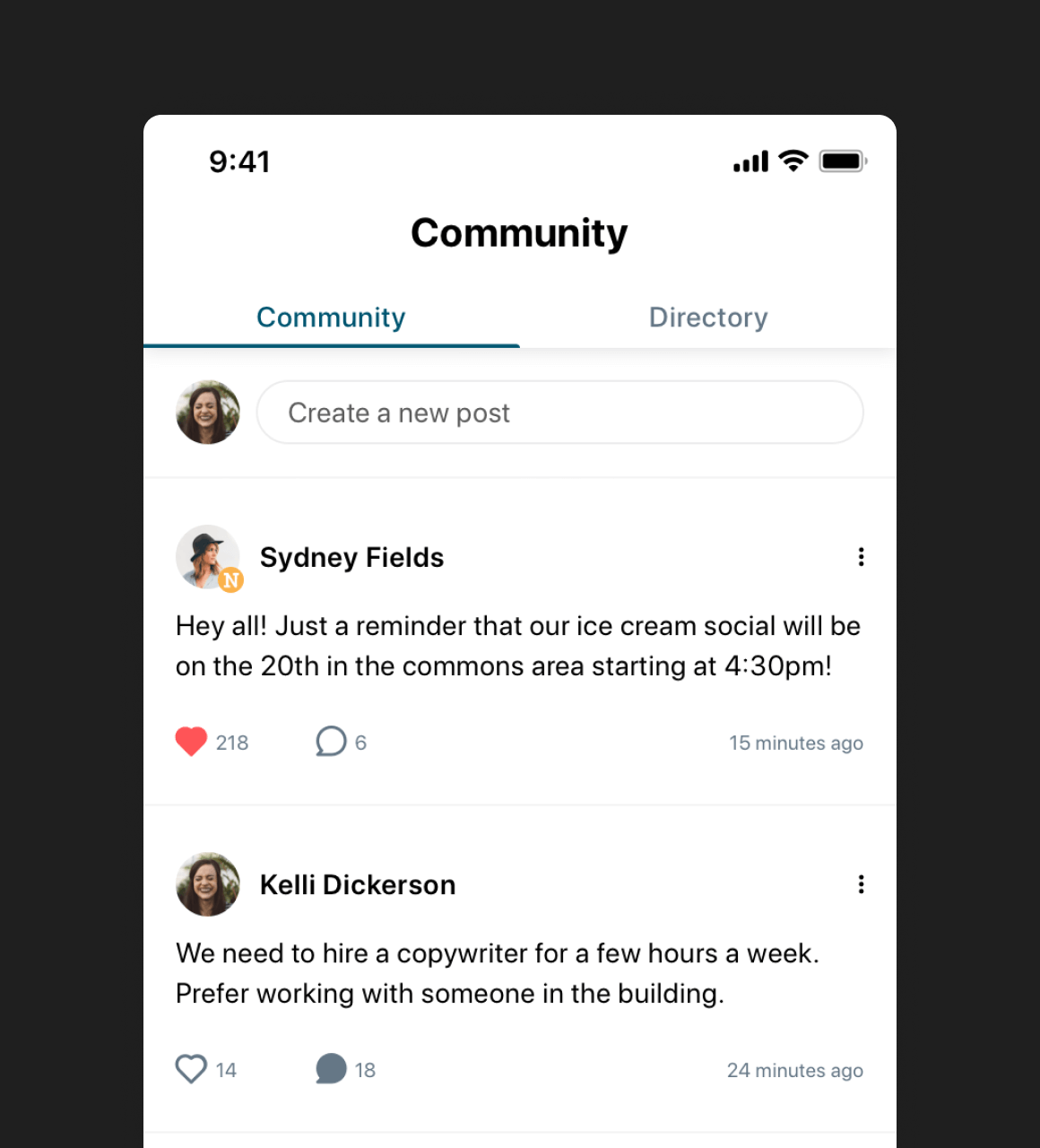
- Community updates: This section automatically pulls in important and timely community posts that your local Novel Coworking team has shared.
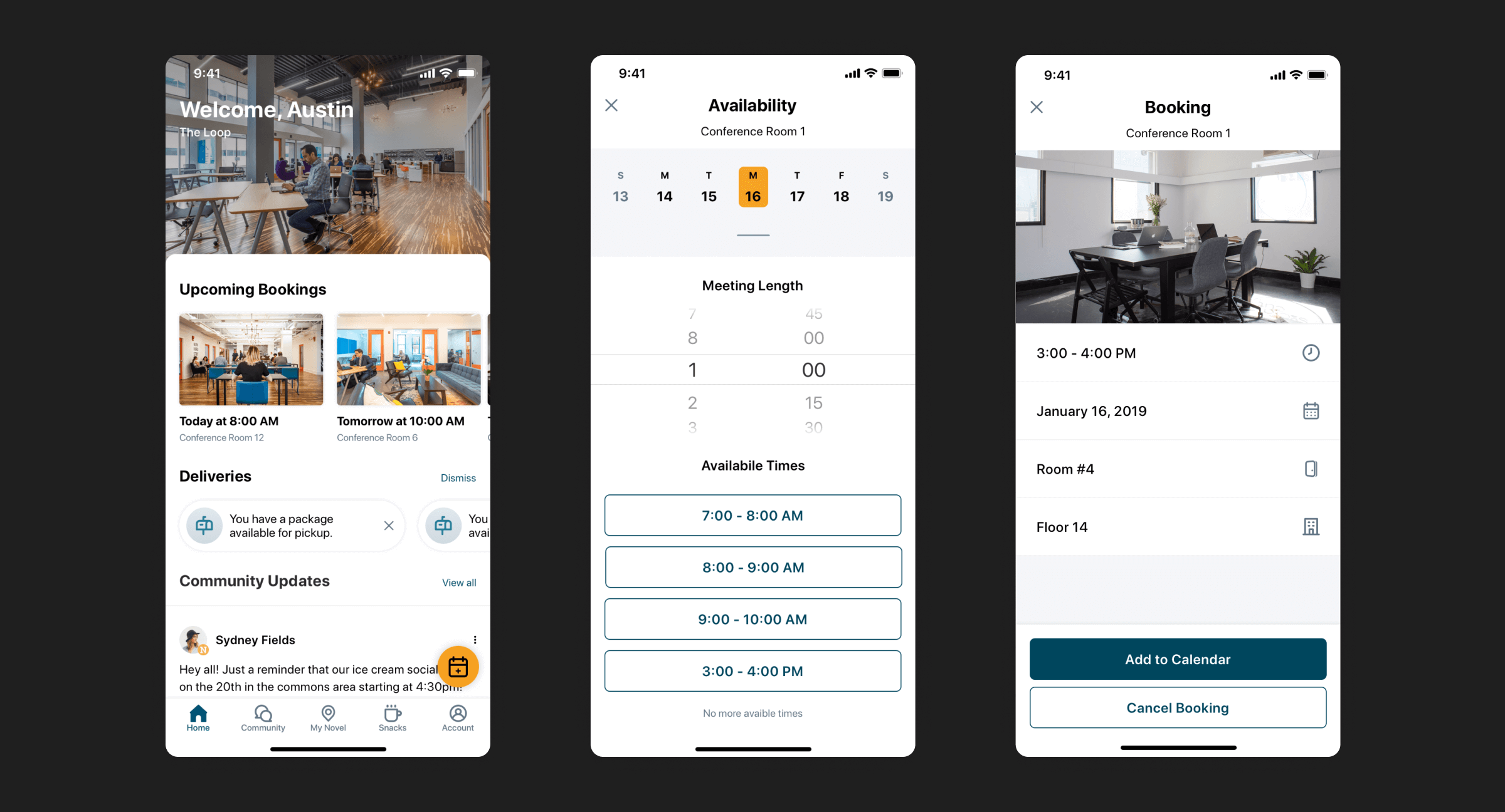
While a bookings screen could have been built out on iOS, I decided to break with iOS norms and use a Floating Action Button that is easy to reach and obvious.
One problem we discovered in wireframing was that we were asking users to start booking their meeting space by selecting a room first. When we had the user start at this point they had a hard time finding a room with availability because they had to switch between rooms to check for open times.
We already decided that we were not building a calendar app, but a reservation app. That helped us think about the reservation process differently and ask users when they had already scheduled a meeting and then show them all of the available rooms they can book. Now the user has visibility into all of the available rooms and their amenities.
This new way of reserving space lead us to create a single view called Availablity. In this view, you select the date and meeting duration, and the app presents you with available rooms. We used duration because this allowed us to remove the need to set a meeting end time helping further simplifying the number of user inputs needed. The rooms listed all fit your needed meeting time, and you can preview them to make sure they have the needed seating or room amenities for your meeting.
We also needed to consider that a group of coworkers will have times where they need to book a specific room based on a need they have to accommodate in the meeting. In this scenario, coworkers can view all rooms within their location in the My Novel tab. When they view a room they can choose to reserve it in the future but instead of room availability, it shows time availability that meets the selected date and duration.
Form
The visual language that you see in the app was intentionally designed to feel both professional and friendly. The app feels tidy and clean, and we balanced that by using a slightly softer look throughout with rounded corners and ovals. We also wanted to use imagery to connect users to the locations the user was working in. Larger cities like Chigaco have more than one Novel location a coworker could use, so it was important to make sure that the hero image represented the space they are currently viewing.
The design is also meant to be easily scaled. Each component in the design follows a simple set of patterns that create a mature, consistent visual experience, while also making it easier for developers to maintain and extend the app in small ways without future design consulting. While I would always like to work with a developer, it is important to think of the customer's situation and the short window of time we are serving them to make sure that when we do provide the "keys" to the system, they can maintain and grow the experience over time.
The Novel team loved how we were able to evolve their existing brand standards to make the app feel modern like other apps the team is used to using. In the end, the team and the Coworkers that rely on the app love the final product, the design, and the overall experience that it provides them when they use the product daily.